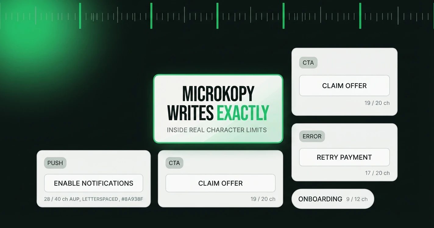
Most advice on how to write microcopy in UI hands you adjectives. Be clear. Be concise. Sound human. That is true and it is nearly useless the moment you are looking at an empty button with a 20 character ceiling and a checkout that has to feel trustworthy. This guide is the version with the strings in it: the seven copy types you actually write, four tones for each, and a character count on every line.
Microcopy is the small functional text inside a product. The button you press, the error you hit, the empty screen before there is any data to show, the one line under a form field. It is not the headline on the marketing site. It is the words that do a job while someone is trying to finish a task, which is why a UX writer and a copywriter approach it differently. If that split matters to you, we pull it apart in UX writing vs copywriting.
Here is the part a normal guide cannot give you. Every example below was generated with MicroKopy's own prompt builders, the same ones behind MicroKopy's generator, then parsed and counted. Nobody wrote them by hand and they did not come from another product's screenshots. Read them as a fast first draft you would edit rather than a finished answer, and read them for the shape: real output, real length, four tones you can hold up next to each other.
The seven types, four tones, every character counted
MicroKopy generates seven copy types. Each block below is one type at four tone presets: professional, friendly, playful, and minimal. The number after each line is its character count, spaces included. Watch how little the meaning moves while the wording swings, and how the count moves with it.
Buttons and CTAs
A button label has the least room and the most weight. It is the last thing read before an action, so it should name the action or the outcome, never the mechanism. For the longer argument and more contexts, see the CTA button copy guide.
| Tone | Copy | Characters |
|---|---|---|
| Professional | Complete Purchase | 17 |
| Professional | Pay & Confirm Order | 19 |
| Professional | Place Your Order | 16 |
| Friendly | Complete Your Order | 19 |
| Friendly | Place Order | 11 |
| Friendly | Confirm & Pay | 13 |
| Playful | Complete My Order | 17 |
| Playful | Pay & Ship It | 13 |
| Playful | Lock In My Cart | 15 |
| Minimal | Pay now | 7 |
| Minimal | Complete order | 14 |
| Minimal | Confirm and pay | 15 |
Error messages
An error arrives when someone is already annoyed. Say what happened, say it without blame, and give the next step. The same card decline reads very differently across tones, and the playful register is the one to handle with care here. There is a full framework in writing better error messages.
| Tone | Copy | Characters |
|---|---|---|
| Professional | Your bank declined this card. Try another card or contact your bank to authorize the charge. | 92 |
| Professional | This card was declined. Please use a different payment method or check with your bank. | 86 |
| Friendly | Your bank declined this card. Try another card or contact your bank to sort it out. | 83 |
| Friendly | That card didn't go through. Double-check the details or use a different card to continue. | 90 |
| Friendly | Payment didn't work this time. Please try a different card or check with your bank. | 83 |
| Playful | Your bank said no to this card. Try a different one, or give them a ring. | 73 |
| Minimal | Card declined. Try another card or contact your bank. | 53 |
| Minimal | Your bank declined this payment. Use a different card to continue. | 66 |
| Minimal | Payment failed. Check your card details or try another card. | 60 |
Empty states
An empty state is the first screen a new user sees before they have done anything. It is prime space to explain what will appear and to offer one clear action. Below, the three parts (a heading, a line of body, a button) are separated by slashes and the count is for the whole string. More on the design side in empty state copy.
| Tone | Copy | Characters |
|---|---|---|
| Professional | No projects yet / Your projects will show up here once you create one. / [Create your first project] | 96 |
| Professional | Nothing here yet / Create a project to start designing. / [New project] | 67 |
| Professional | Start your first project / This is where all your projects will live. Add one to get going. / [Start a project] | 107 |
| Friendly | No projects yet / Create your first project to start designing, prototyping, and sharing your work. / [Create a project] | 116 |
| Friendly | Your projects will show up here / Once you create one, you'll be able to organize files, invite teammates, and track progress. / [New project] | 138 |
| Playful | Nothing here but potential. Start a project and watch this space fill up. New project | 85 |
| Minimal | No projects yet. Create one to get started. / [New project] | 58 |
| Minimal | Your projects will show up here. / [Create project] | 50 |
| Minimal | Nothing here yet. Start your first project. / [Start project] | 60 |
Tooltips
A tooltip only shows when asked, so it should answer one question and stop. Even playful products keep tooltips functional, because the reader is in "what does this do?" mode, not "entertain me" mode. There is a longer piece on tooltip UX writing.
| Tone | Copy | Characters |
|---|---|---|
| Professional | Blocks exports and syncs until every design error is fixed. | 59 |
| Professional | Flags spacing, color, and naming issues that don't match your design system. | 76 |
| Professional | Enforces your design system rules and stops inconsistent styles from being used. | 80 |
| Friendly | Blocks anything that doesn't match your design rules exactly. | 61 |
| Friendly | When on, small inconsistencies get flagged instead of ignored. | 62 |
| Friendly | Turns on stricter checks, so nothing off-spec slips through. | 60 |
| Playful | Enforces every design rule to the letter, so nothing slips through by accident. | 79 |
| Minimal | Blocks actions that break your design rules. | 44 |
| Minimal | Flags errors instead of letting them pass. | 42 |
| Minimal | Stops exports until all issues are fixed. | 41 |
Form labels
Labels are where tone almost disappears. Look at the professional, friendly, and minimal rows: for a work email field they land on the same handful of words. Only the playful preset reaches for personality, and it pays for that with characters. Worth knowing before you brief a writer to make your forms sound warmer.
| Tone | Copy | Characters |
|---|---|---|
| Professional | Work email | 10 |
| Professional | Work email address | 18 |
| Professional | Your work email | 15 |
| Friendly | Work email | 10 |
| Friendly | Your work email | 15 |
| Friendly | Work email address | 18 |
| Playful | Work email | 10 |
| Playful | Your work email | 15 |
| Playful | Work email (the one you actually check) | 39 |
| Minimal | Work email | 10 |
| Minimal | Work email address | 18 |
| Minimal | Email (work) | 12 |
Confirmations
A confirmation reports what just happened, above all when it cannot be undone. Naming the blast radius ("all 40 files") is the difference between reassurance and a shrug.
| Tone | Copy | Characters |
|---|---|---|
| Professional | Project deleted. All 40 files were removed with it. You can start a new project anytime. | 88 |
| Professional | Project removed, including all 40 files. This can't be undone. | 62 |
| Friendly | Done! Your project and its 40 files have been removed for good. | 63 |
| Playful | Poof! Project and all 40 files are gone for good. | 49 |
| Playful | Deleted. That's 40 files back into the void. | 44 |
| Playful | All clear! Project and its 40 files are history. | 48 |
| Minimal | Project deleted. All 40 files are gone. | 39 |
| Minimal | Deleted. Your project and its 40 files are gone for good. | 57 |
| Minimal | Project and 40 files deleted. | 29 |
Notifications
A push notification has two fields with two jobs. The title identifies and signals, the body gives the reason to tap. Both have their own ceiling, so both get a count. If you write these often, there is a whole guide to push notification copy.
| Tone | Title | Title chars | Body | Body chars |
|---|---|---|---|---|
| Professional | Trial ends in [days_left] days | 30 | Upgrade now to keep your projects, files, and exports fully accessible. | 71 |
| Professional | Your export is ready | 20 | [file_name] has finished exporting. Tap to download it now. | 59 |
| Professional | New comment from [sender_name] | 30 | [sender_name] commented on your design. Tap to view and respond. | 64 |
| Friendly | Your trial ends in [days_left] days | 35 | Upgrade now to keep your projects, exports, and comments moving without a break. | 80 |
| Friendly | [sender_name] left a comment | 28 | Tap to see what [sender_name] said and reply right in your file. | 64 |
| Playful | Tick tock ⏰ | 11 | Only [days_left] days left on your trial. Lock in a plan so nothing gets left behind. | 85 |
| Playful | Fresh export! 📦 | 16 | [file_name] is packed and ready. Tap to download and show it off. | 65 |
| Playful | New comment 💬 | 14 | [sender_name] just chimed in on your design. See what they think. | 65 |
| Minimal | Trial ends in [days_left] days | 30 | [days_left] days left. Upgrade to keep your work. | 49 |
| Minimal | Export ready | 12 | [file_name] is ready to download. Tap to view or share. | 55 |
| Minimal | [sender_name] commented | 23 | New feedback from [sender_name]. Tap to reply. | 46 |
What changes across tones, and what does not
Read down the tone columns and a pattern shows up. On a button or a form label, tone barely registers, because the space is too small to carry it. On an error, an empty state, or a notification, tone has room to change the feel of the whole message. That is the practical rule: spend your tone budget where there are characters to spend it, and keep the tightest slots plain.
One more thing the raw output taught us. The generator occasionally reached for a long dash to join two clauses, which is one of the clearest signals that a machine wrote a line. Those were edited out here by hand, which is exactly the kind of pass generated copy still needs. For a wider set of patterns pulled from shipping products, see our microcopy examples.
Why the character count is on every line
Length is not a style preference, it is a constraint the layout imposes. A primary button holds a few words before it wraps or clips. A push notification title is cut by the operating system somewhere around thirty characters, and the reader never sees the rest. A tooltip that runs three sentences means the interface failed to explain itself and copy is covering for it.
Writing to a known ceiling changes the work. Instead of writing a line and hoping it fits, you set the number first and choose among options that already respect it. That is why every example here carries its count, and why the counts are the detail practitioners actually ask for.
The three things most guides skip
Screen readers
A screen reader announces the text, not the picture. An icon-only button with no label is a silent button. The fix is an aria-label that reads like the microcopy would if it were visible: "Delete project", not "trash icon". Error messages need to be announced the moment they appear, through an assertive live region or role="alert", or a blind user keeps fixing a form they cannot tell is broken. A label that lives only as placeholder text vanishes the instant someone types, and it was never read aloud to begin with. The accessibility notes in form validation copy go deeper on the field-level version of this.
Localisation
English is one of the shorter languages you will ship in. The same string is often noticeably longer in German or Finnish, so a button that fits at home can wrap or truncate once translated. A character ceiling set in English gives your translators a target instead of a surprise. Two habits matter most. Leave room, so a snug English line has somewhere to grow. And never build a sentence out of concatenated fragments, because word order is not universal and the pieces will reassemble into nonsense. The generated notifications above use whole strings with placeholders like [file_name] and [days_left] for exactly this reason: the variable slots in, the sentence stays intact.
Testing your copy
You can catch most copy problems before a build. Read the line aloud; if you stumble, the user will too. Render it at the real width with the longest realistic value, so [sender_name] becomes a genuinely long name and not "Sam". Run one screen-reader pass over the flow. Where you have the traffic for it, an A/B test settles arguments that taste cannot, though it carries a real cost: version B ships to real people, so never test something that could cost a user money or data. Most of the time the character count catches the overflow long before any of that.
A pre-ship checklist
- Name the action or the outcome, not the mechanism behind it.
- Know the ceiling before you write, then write to it.
- Say what happens next, above all after an error or a delete.
- Make the label mean something on its own, so a screen reader can use it.
- Check the longest realistic value, then translate and check the width again.
Where to start
Pick the one screen where users hesitate most and rewrite its copy against this list. You will usually find a button that hides its outcome, an error that blames the reader, or an empty state that says nothing. If you would rather start from options than a blank field, MicroKopy will generate all seven types to a character ceiling you set, and the demo runs without an account. Either way the goal is the same: words that do their job and get out of the way.
Frequently asked questions
- What is microcopy in UI?
- Microcopy is the small functional text inside a product: button labels, error messages, empty states, tooltips, form labels, confirmations, and notifications. It guides someone through a task, rather than selling to them the way marketing copy does.
- What are the main types of microcopy?
- This guide covers seven that MicroKopy generates: button and CTA copy, error messages, empty states, tooltips, form labels, confirmations, and push notifications. Each has its own length limits and its own job on the screen.
- How long should microcopy be?
- It depends on the slot, which is why every example here carries a character count. Primary buttons run best at two to five words, push notification titles get cut around thirty characters, and a tooltip that needs three sentences usually means the interface, not the copy, has a problem.
- How do I choose a tone for UI copy?
- Spend tone where there is room for it. On tight slots like buttons and form labels the tone barely registers, so keep them plain. On errors, empty states, and notifications there is space for a professional, friendly, playful, or minimal voice to change how the message lands.
- How do I make microcopy accessible?
- Give every icon-only control an aria-label that reads like visible microcopy, announce errors through an assertive live region or role="alert", and never rely on placeholder text as a label, because it disappears once someone types. See form validation copy for the field-level detail.
- Should AI write my microcopy?
- Treat generated copy as a fast first draft, not a final answer. It is good at producing options to a character ceiling and holding a consistent tone, but it still needs a human pass. The examples in this post were generated with the MicroKopy prompt builders and then edited, and that edit is the point.
We build the copy layer for product screens: tone presets, character ceilings and a review trail that travels with every string.